React Native
Chat App UI/UX: Design Patterns That Make Users Stay
Chats don’t fail because they’re missing a feature. They fail because the unread count is in the wrong place, the composer scrolls behind the keyboard, and the reply context disappears before the user can act on it. Users want chat to be easy and understandable, which makes a smart UI/UX critical.
75% of users make conclusions about your brand’s credibility based on UI/UX. If designed correctly, it can increase customer loyalty and foster a stronger emotional connection, skyrocketing conversions by up to 400%. But if customers can’t get what they came for, they’ll leave. Chats are one of the main channels you interact with your customers. In this piece, we’ll consider features, accessibility, AI, common mistakes, and chat app UX/UI best practices.
In this guide
- Design principles before patterns
- Chat inbox/index screen
- Chat bubble and thread
- Message composer
- Background, color, and theming
- Accessibility
- AI-era patterns
- Mobile-first gotchas
- Ethora React UI Kits
Design Principles Before Patterns
A proper user experience design is a competitive advantage that can bring you $100 ROI on each $1 invested. These four principles will help you build a clear UX, so users won’t struggle getting what they came for. The principles are fundamental: Get them wrong, and individual pattern decisions don’t matter – the whole thing feels off.
Speed of read
Users scan the inbox in under a second. Density and hierarchy determine whether they tap the right conversation or scroll past it. If it takes effort to find the thing they care about, they stop checking.
Trust by clarity
Delivery receipts, presence dots, and timestamps exist to remove anxiety, not decorate the interface of your chat app. The moment a user can’t tell whether their message has been sent, they start second-guessing the product.
Cohesion over flair
Chat is a tool people use for hours. Visual noise that’s attractive for 30 seconds becomes exhausting at 30 minutes. Every decorative choice has a cost in terms of session length.
Accessibility by default
WCAG 2.2 AA is the floor, not a stretch goal. High contrast, dynamic type support, semantic order, and focus management aren’t add-ons – they go in with the first build.
Chat Inbox/Index Screen Design
This screen is harder to get right than the chat thread, which runs counter to how most teams prioritize it. First contact, two-second judgment, either they tap, or they scroll past. Let’s look closer at chat inbox design best practices.
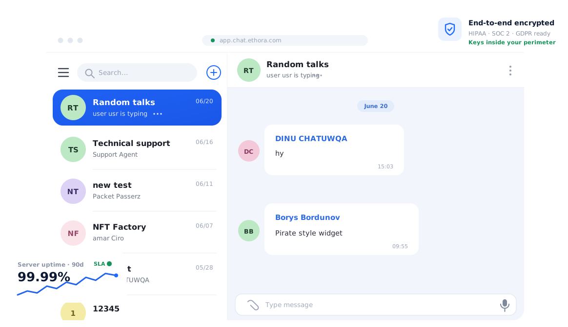
Message preview + timestamp
One-line snippet, relative time (“12m”) right-aligned on the same row as the name. Truncate with an ellipsis at the visible edge. Important exception: if your product is end-to-end encrypted and your privacy policy doesn’t permit server-side preview generation, this field shows nothing or shows “Encrypted message” – not a cached plaintext snippet.
Implementation note: Use a single line height limit and CSS ellipsis overflow. Don’t truncate in JavaScript mid-render; it flickers on resize.
Search at the top
Large tap target, always visible, with voice input available on mobile. Recent searches should surface on first tap so the user doesn’t have to retype the same query they made last session. Buried search is one of the most reliable ways to make a dense inbox feel worse than it is.
Implementation note: Debounce input at ~200ms; show a “clear” button once the field has content; auto-focus on mount when the user navigates to a search state.
Quick actions via swipe (mobile) or hover (web)
Mute, archive, mark read, delete – available without opening the conversation. Use the platform convention that users already have muscle memory for: swipe-left on iOS reveals destructive actions, long-press on Android opens a contextual menu. Don’t invent a new gesture; you will lose.
Implementation note: On web, hover reveals an action row with icon-only buttons. Add accessible labels for screen readers – icons alone don’t have semantic meaning.
Presence indicators
Green dot for online, gray for away, hollow ring for offline. Keep the sizes small – they’re supporting information, not a headline. Always give users an opt-out; some people will specifically not want their employer or peers seeing when they’re active.
Implementation note: Presence state comes from a real-time channel, not REST polling. If WebSocket drops, show the last known state with a slight opacity reduction rather than flipping to offline incorrectly.
Unread count + bold conversation name
Use both signals together. The count alone is missed in a fast scan because it’s a small number in a peripheral position. The bold name is a much larger change to the visual field. Either alone is weaker than both together.
Pinned conversations
A visually distinct top section – slight background tint or a pin icon – that never moves no matter what activity happens below. The visual separation has to be clear enough that users don’t lose their pinned items when the inbox reorders.
Group avatars
Overlapping circles (up to 3) or a 2×2 grid for larger groups. Always provide an initial-based fallback when a member has no photo, using a consistent color-hash from the user ID so the same person always gets the same background color across sessions.
Filter chips
All/Unread/Mentions/Groups. Optional at small scale, but above roughly 100 conversations they stop being optional – users with that many threads can’t function without a way to filter to what needs action. Keep the chips horizontal and pill-shaped; they’re navigational affordances, not tags.
Mute and snooze states
A muted conversation with an unread message is a different state from a read conversation. The visual treatment has to reflect this: the unread styling stays, but a muted-bell icon makes clear that no notification fired. These two pieces of information together prevent the confusion of “I missed this” vs “I chose not to be notified.”
Empty state
A friendly illustration and a single CTA to start a new conversation. A well-designed chat empty space is never a blank screen – blank signals broken to most users, not “new and unused.” The CTA should be the one primary action, not a grid of options.
Loading state
Skeleton list, not a spinner. Skeleton preserves the visual structure so the user keeps their orientation while data loads. A centered spinner tells them nothing about what’s coming, and the layout shift when content arrives feels worse.
Implementation note: Skeleton items should match the approximate height of real conversation rows. Variable-height skeletons that don’t match actual content cause a visible layout shift.
Chat Bubble and Thread
The thread screen is a part of the chat app UI design where users spend most of their time. The decisions here compound more than anywhere else – get message grouping wrong and every conversation looks cluttered; get receipts wrong and users think their messages are failing. Each of these patterns is worth getting right the first time.
Sender vs receiver distinction
Different background color, or different alignment (left vs right), or both – but stay consistent. The most common mistake is doing alignment AND flipping the avatar position AND changing the tail direction AND adding a different font weight. Pick the minimum combination that makes the sender and receiver distinct, then stop.
Bubble shape
Soft rounded corners with or without a directional tail – both conventions work. What matters more is consistency: the same border radius on text messages, image messages, file attachments, and system messages. Inconsistent corner radii across message types is one of those things users can’t articulate but can feel.
Timestamps
Group by minute or hour to collapse visual noise – showing a timestamp on every individual message makes the thread feel like a log. Show per-message timestamps on tap or hover for those who need them. This pattern is directly from iMessage and Telegram, both of which refined it over years of user research, you can borrow for free.
Read receipts
Single check (sent to server), double check (delivered to device), filled or colored (read). User-controllable – some people will specifically not want their read status visible to others, and forcing visibility on both sides without an opt-out will cause real friction in professional contexts.
Implementation note: The receipt state should update in real time via the existing WebSocket connection, not via a polling refresh. A receipt that takes 10 seconds to flip to “read” feels broken.
Avatars in threads
In 1:1 conversations, you can hide the receiver’s avatar since the identity is already established – the whole conversation is with one person. In group threads, always show the sender’s avatar alongside received messages. Consistency matters more than saving a few pixels: users build a mental model of where avatars appear, and exceptions break that model.
Threaded replies
Quote a snippet of the parent message at the top of the reply, tappable to scroll back to the original. The quoted text should be truncated to roughly one line – enough to identify the context, not enough to break the rhythm of reading the current thread.
Reactions
Small reaction bar anchored below the bubble or at its corner. Stack identical reactions with a count when multiple users react the same way. The tap target for adding a reaction should be generous – this is a frequently-used interaction on mobile, and a 20px hit area is too small for it.
Message grouping
Messages from the same sender within ~60 seconds form a single visual cluster: one avatar, one timestamp, no repeated name labels. This is the single pattern that makes a thread look like a conversation rather than a log file, and most teams implement it but with the wrong threshold – 5-minute grouping makes threads look artificially sparse.
Link previews
Image, title, and description card below the message text. Lazy-load so the message appears immediately and the card fills in behind it. Give users a way to disable previews both globally (in settings) and per-conversation – some people will have reasons to not want URLs to be fetched by your servers.
File attachments
Type icon, filename, file size. Optional thumbnail for image-based formats. An explicit “Download” button – auto-download only optionally. Auto-downloading files onto a user’s device without consent is one of the few patterns that generate immediate negative reviews.
Images and video
Tap to expand full screen, pinch to zoom, swipe down to dismiss. The swipe-down-to-close gesture is now platform-universal on both iOS and Android and has been for several years – implement it.
Edited and deleted states
Edited: small “edited” tag with a timestamp, visible in the bubble. Deleted: replace the content with “This message was deleted” in the original bubble position – don’t remove the message from the thread entirely, because that breaks reply context for anyone who already replied to it.
Reply-to gesture
Swipe right on mobile (the WhatsApp/iMessage convention), hover the button on web. When active, a pinned preview of the quoted message sits above the composer so the user can see what they’re replying to while composing.
Mentions
Distinct color (usually the primary accent), tappable to a user profile. In the inbox, conversations containing unread mentions need a distinct unread indicator – a different badge style or a @ prefix – because mentions require a response in a way that general messages often don’t.
System messages
Neutral background, center-aligned, smaller text than conversation messages. “User joined the group,” “Encryption enabled,” “Call ended.” These are metadata, not conversation – the visual treatment should make that obvious.
Long-press / right-click context menu
Copy, reply, forward, react, edit (own messages only), and delete messages. Keep the same options in the same order across platforms – different menus on iOS and Android for the same action is a support ticket factory.
Voice notes
Waveform visualization, play/pause button, scrubber, playback speed toggle (1×, 1.5×, 2×). The playback speed option is more important than it looks – voice notes above about 30 seconds that can’t be scrubbed or sped up cause real friction, and this is an area where Telegram has pulled significantly ahead of competitors.
AI assistant messages
Distinct bubble – left-aligned, with a model or spark icon rather than a user avatar. Streaming animation while the response generates (blinking cursor at the text edge, or a pulsing underline). Citation chips or footnotes below the answer, tappable to the source. The visual difference from human messages is not optional – users need to know which messages are AI-generated.
Implementation note: token-by-token streaming means appending to the same message element rather than creating new ones. Use a ref to avoid React re-renders on every token.
Error and empty thread states
Failed send: show a red indicator and a “Retry” button directly in the message bubble. Don’t silently drop the message or rely on the user noticing that the check mark never appeared.
Empty thread: a gentle illustration and suggestion chips (“Say hi,” “Ask a question”) – not a blank white screen.
Message composer
The composer is where most chat apps fight a losing battle between density and discoverability. Everything wants to be visible; not everything can be. The patterns that work prioritize the primary action – sending a text message – and put everything else one level deeper.
Input field placeholder
“Message” is enough. Resist the urge to make it clever – the placeholder disappears the moment someone starts typing, so nobody except new users sees it more than once.
Multi-line growth
The composer starts at one line and expands up to roughly five lines as the user types, then scrolls internally for longer messages. Capping the expansion height prevents the keyboard and composer from consuming the whole screen on mobile.
Implementation note: Use a controlled textarea with auto-resize logic tied to scrollHeight. On React Native, TextInput’s multiline prop plus a maxHeight style handles this cleanly.
Send button state
When the field is empty, show a microphone icon (voice input). When text or an attachment is present, replace it with a send arrow or button colored with the primary accent. This contextual swap is a convention in WhatsApp, iMessage, and Telegram – breaking it confuses users who’ve built muscle memory around it.
Attachment menu
A single + icon that opens a bottom tray on mobile: camera, photo library, file picker, location, contact, poll. Keeping these behind a single tap preserves composer density. Don’t surface them as separate icons in the composer row – that pattern dates to 2014, and the tray pattern has replaced it for good reason.
Emoji and GIF picker
One emoji button in the composer that opens a full picker. GIFs live inside the emoji picker on mobile, not as a separate button – the extra icon isn’t worth the permanent space on a small screen.
Voice input
Long-press the microphone to begin recording; slide left to cancel without sending; release to send. This is the WhatsApp interaction model, and it’s been stable for years. Users who’ve used WhatsApp already know it. Deviating requires teaching a new pattern for no gain.
Slash commands and AI invocations
Typing “/” triggers a suggestion list above the composer with fuzzy match as the user continues typing. “@ai” or a configurable trigger can invoke an AI assistant directly from the composer. The suggestion list should close immediately on Escape and should not interfere with normal typing if the slash was accidental.
Reply preview above composer
When the user is replying to a specific message, a compact quoted preview sits between the thread and the composer. An × closes it and cancels the reply context. This preview should persist even if the user switches to another app and returns – losing the reply context on background is a common and annoying bug.
Edit mode
When editing a sent message, the composer shows an “Editing” label, prefills the original text, and replaces the send button with a confirm/save button. Escape or × cancels. The edit state should be visually unambiguous – users who accidentally trigger edit mode need to know immediately that they’re not sending a new message.
Chat background, color, theming
Chat theming debates consume a disproportionate amount of design time for the amount of impact they have on retention. The floor matters; everything above it is taste.
Light default, dark mode mandatory
Detect the system preference automatically. Provide a manual toggle in settings for users who want to override it. Dark mode isn’t optional anymore — it’s expected on iOS and Android, and forcing light-only in a low-light environment will generate app store reviews about it.
Contrast ratios
Body text against its background: minimum 4.5:1 per WCAG 2.2 AA criterion 1.4.3. Bubble text against bubble background: same. Large text and UI elements (icons, borders): minimum 3:1. Verify both your light and dark themes with a tool like WebAIM’s contrast checker before shipping – eyeballing contrast ratios in design tools is unreliable.
Muted accent colors
Reserve saturated accent color for send buttons, mention highlights, and links. Never apply it to entire message bubbles in a group chat – if every sender has an accent-colored bubble, nothing is highlighted, and the color system collapses. Use colored sender name labels inside bubbles instead, which preserves identity without the visual noise of full-color backgrounds.
Wallpaper as opt-in
Let users pick or import a wallpaperю Never ship a custom wallpaper as the default. Default wallpapers reduce contrast for every user who never touches settings, which is most of them.
Density toggle
Comfortable vs compact – the Slack pattern. Power users on the web with large monitors want compact density; users on mobile with smaller viewports want comfortable spacing. Both groups are right. Providing a toggle costs one setting and removes an entire category of “the spacing feels wrong” feedback.
Token-driven design system
Design tokens – colors, spacing, border radii, type scale defined as named variables – are the difference between a theme that can be updated in an afternoon and one that requires hunting through 200 components. Define tokens first, apply to components, and treat the token file as the single source of truth across web and native. Adobe Spectrum’s token documentation is a good reference for token taxonomy.
Accessibility
The word “accessibility” is in chat design briefs constantly and in shipped chat products rarely. These aren’t optional – WCAG 2.2 AA is a legal requirement in the EU, UK, Canada, and Australia, and an increasing number of US jurisdictions are treating it as a baseline for any digital product. More practically: screen reader users, users with motor impairments, and users in low-light environments are real users in every product’s user base.
Color contrast minimum
4.5:1 for body text, 3:1 for large text (18pt+ or 14pt bold+) and meaningful UI elements. This applies to both light and dark themes independently — a dark theme that meets contrast requirements in dark mode but fails in light mode still fails.
Dynamic type
Respect the operating system font size setting. On iOS, this is Dynamic Type; on Android, it’s the system font scale. Message bubbles must grow with the text, not clip it. Input fields must expand. This is one of the most commonly broken accessibility requirements in chat interfaces – test at the largest system font size before shipping.
Screen reader semantics
Each message should be announced with author name, timestamp, and message content in that order – not author, content, timestamp (which is how they appear visually, but not how they’re most useful to read). System messages should be clearly labeled as system messages, not read as if they’re from a user. Test with VoiceOver on iOS and TalkBack on Android, not just automated tools – automated tools miss ordering and context errors.
Focus management
When a modal, sheet, or panel opens, focus should move into it. When it closes, focus should return to the element that triggered it. Chat interfaces are particularly bad at this because they have so many transient surfaces – the emoji picker, the attachment tray, the reaction menu, the reply preview. Each of these is a focus trap that needs deliberate management.
Keyboard navigation on the web
Full keyboard navigation and visible focus rings. The focus ring should be distinct enough to see – not a 1px outline that disappears against similar backgrounds.
Reduced motion
Respect prefers-reduced-motion. The typing indicator animation, the streaming token cursor, and the reaction pop animation – all of these should have a static alternative. A label that says “typing…” is a correct and accessible substitute for animated dots. Vestibular disorders and motion sensitivity affect a larger percentage of users than most designers assume.
Voice note transcripts
Auto-transcription, when available, is displayed on demand. Required for compliance in some regulated sectors, and useful for everyone who receives a voice note in a meeting and can’t play audio. This is increasingly a baseline expectation rather than an advanced feature.
Image alt text
When users attach images, prompt them for alt text – or auto-generate a description via a vision model with a user-facing override. Alt text on user-generated images is one of the hardest problems in chat accessibility because you can’t predict what users will send, but building the prompt into the upload flow captures most cases.
Color-blind safe patterns
Never rely on color alone to communicate a state. The read receipt should differ in shape – filled vs unfilled check – not only in color (gray vs blue). Unread vs read conversations should have both bold text and an unread count, not just a blue dot.
RTL and multilingual support
The composer, bubbles, and thread layout must mirror correctly for Arabic, Hebrew, and Persian. This means start/end CSS properties rather than left/right, and RTL testing as part of the standard test suite rather than an afterthought. Products that ship in markets where right-to-left languages are common and then patch in RTL support afterward pay a significant re-architecture cost that early design decisions could have avoided.
AI-Era Patterns Most Chat Designs Are Catching Up To
These aren’t experimental anymore. If your product has any AI feature in the conversation layer – an assistant, a summarization tool, smart replies, anything – these patterns determine whether users trust it or learn to ignore it.
AI assistant as a participant, not a disguised human
Distinct bubble, a clear model or spark icon instead of a user avatar, and some form of disclosure that this message came from a model. Products that try to make AI messages indistinguishable from human messages create trust problems that are very difficult to recover from when users notice – and they notice.
Streaming responses
Token-by-token rendering with a blinking cursor or pulsing underline at the text edge. The user should be able to interrupt or stop the generation if it’s going in a direction they don’t want. A streaming response that renders all at once after a 3-second pause feels slower and worse than a response that starts appearing in under a second, even when total latency is identical.
Implementation note: use a writable stream or WebSocket message handler that appends to the same DOM element rather than replacing it. React’s useRef pattern prevents unnecessary re-renders on every incoming token.
Citations and sources
Chips or numbered footnotes below the AI response, tappable to the source document or URL. This is the single most effective pattern for building trust in AI responses – users who can verify the claim are more likely to act on it. Products that ship AI responses without any sourcing mechanism are trading short-term convenience for long-term user skepticism.
Smart replies
Three short suggestion chips above the composer, generated from conversation context. Tap to insert into the composer, not to auto-send – inserting lets the user edit before committing, which is a meaningful trust difference. Don’t generate smart replies for every message, only for ones where a quick response is actually likely.
Slash and agentic actions
“/summarize,” “/translate,” “/schedule” – slash commands that produce structured outputs directly in the bubble rather than redirecting to a separate tool. The output format matters: a summary should look like a summary (shorter text, possibly with bullets), not like a regular message that happens to contain one.
Confidence and uncertainty signals
When the model genuinely doesn’t know something, the UI should reflect that. A subtle indicator – a question mark suffix, a “I’m not certain about this” label, or a greyed confidence bar – is better than silent hallucination. Users calibrate trust over time; giving them accurate signals about uncertainty accelerates that calibration in the right direction.
AI opt-out per conversation
A clear, accessible way to disable AI features for a specific conversation or globally. Users in certain professional or personal contexts will have reasons to want a clean conversation without AI involvement. Making this hard to find or defaulting to on-and-locked creates friction and sometimes policy violations.
Mobile-First Patterns
These aren’t edge cases – they’re patterns that fail on most chat apps that were designed desktop-first and ported to mobile. Each one generates a disproportionate share of negative reviews relative to how simple it is to fix.
- Bottom sheet for modals, not centered dialogs. A bottom sheet on mobile fits the thumb zone and respects the way people actually hold phones. A centered dialog that floats in the middle of the screen requires a stretch or shift of grip to interact with.
- Tap targets ≥ 44pt on iOS / 48dp on Android. Per Apple’s HIG and Material Design 3. Reaction buttons, quick action buttons, and avatar taps in dense list views all fail this requirement regularly.
- Keyboard avoidance. The composer must dock above the software keyboard, not behind it. This sounds basic; it’s broken in a surprisingly large number of React Native apps where the KeyboardAvoidingView configuration is wrong for one platform.
- Safe areas. Respect the notch, Dynamic Island, and gesture bar. Nothing should be clipped or require a tap behind a system-level affordance.
- Haptic feedback on key actions. Send, reaction tap, and important state changes (delivery confirmed, message failed) all benefit from a short haptic pulse. It costs nothing and makes the app feel more native.
- Offline-first with optimistic sends. Show the message immediately as if it were sent, then reconcile when connectivity returns. The alternative – blocking the send until a server acknowledgment arrives – makes the app feel slow on every send, and noticeably broken on any degraded network.
Ship Chat UI Faster with Ethora React UI Kits
The patterns in this article represent months of iteration in any greenfield build. The inbox alone has eleven distinct states worth handling correctly; the thread screen has over twenty. Most teams building a chat feature for the first time underestimate this scope by a factor of three and discover the actual list around week six.
Ethora’s chat SDK with React UI Kits ships production-grade components for every screen described here – inbox, 1:1 thread, group thread, AI assistant bubble with streaming and citations, system messages, composer with all states, error, and empty states. Unlike the UI kits from other SDK providers, the full React source is included. You’re not styling an opaque widget; you’re modifying components you own. Theme via tokens – one config file changes your colors, radii, and spacing across all components.
Whether you’re building a messaging app, internal communication tool, or support chat for your application, Ethora has everything you need, from a simple chat widget for marketplaces and scalable architecture for streaming platforms to self-hosted AI and built-in compliance healthcare, finance, and other regulated industries.
If you’re looking for full source ownership, BYO-LLM for AI features, and a flat pricing structure that doesn’t grow with user count, Ethora is a perfect choice. Drop us a line, and let’s discuss how we can help your business.

Share with your community


More Articles
Development
Oct 5, 2026
Cross-Platform App Development Frameworks in 2026: 10 Options Compared, Real Trade-offs, and Chat + AI SDK Fit
In 2026, evaluating cross-platform frameworks is a complex matter. There are many practical questions: Which ones have solid chat and AI SDK support today? Which ones won’t force a painful migration when the next major OS version drops? And what are the real engineering trade-offs once you move past the marketing claims? We’ll look at […]


Healthcare
Oct 1, 2026
HIPAA-Compliant Video API in 2026: What Actually Makes One, Vendor Comparison, and Twilio Video Migration
Consultations, psychiatry meetings, medication management, triage, and other medical encounters often do not require physical presence. Adding video to your healthcare app or platform can be a great idea, as it allows you to hold sessions online without losing the human touch. Using a messaging API to incorporate video into your application makes the whole […]

Try Out Ethora in Action
Experience Ethora's messaging with a dedicated demo from our CEO or start building your App right now!