Javascript
React Toastify: Complete Guide to Toast Notifications in React (2026)
At some point, every React app needs toast notifications. A form submits, a file uploads, an API call fails – the user needs to know. Toast is how you tell them without blowing up their whole screen.
But teams can burn a week building their own notification system. It starts simple – a div that fades in, a setTimeout, a bit of CSS. Then someone asks for an undo button inside the toast. Then, a progress bar for uploads. Then the design system team wants custom colors. Then QA finds it’s not accessible. Before long, you’ve got 400 lines of code doing what a library already does better.
React Toastify is what can significantly improve the experience. This guide covers v11 top to bottom: setup, all five notification types, positioning, CSS variable theming, promise toasts, upload progress, transitions, drag-to-dismiss, and accessibility. Every section has working code you can drop straight into a project.
Why React Toastify Matters
It’s a library for adding toast notifications to React. One component in your tree, one function call wherever you need a notification – that’s genuinely all the setup. npm trends puts it at roughly 3.5 million weekly downloads and over 13,400 GitHub stars. It’s used in more than 3,000 other packages. You’ve almost certainly worked in a codebase that uses it.
The numbers aren’t surprising once you try it. Even a minimal homegrown toast setup needs render portals, z-index management, ARIA live regions, animation cleanup, and some way to handle stacked notifications. None of that is rocket science individually, but it adds up. Toastify ships all of it out of the box.
Version 11 was a real improvement over v10, not just a version bump. A few things worth knowing before you start:
- No CSS import needed – the stylesheet injects automatically when
<ToastContainer />mounts. You can still import it manually if you’re on Next.js and getting SSR headaches - Simpler DOM – the Toastify_toast-body wrapper is gone. If you were targeting that class in your CSS, those rules are now dead and won’t tell you
- CSS variables for theming – override :root variables instead of fighting specificity wars. This alone makes v11 worth upgrading to
- Keyboard accessibility – Alt+T focuses the first visible toast. Overrideable via hotKeys
- React 18+ only — if you’re still on React 17, stick with v10
Installation & Basic Setup
Now let’s move to practice.
# npm
npm install react-toastify

# yarn
yarn add react-toastify
Standard install:
import { ToastContainer, toast } from 'react-toastify';

function App() {
  const notify = () => toast('File saved successfully!');

  return (
    <div>
      <button onClick={notify}>Save</button>
      <ToastContainer />
    </div>
  );
}
That’s a working toast notification. No CSS import, no provider, no configuration. Put <ToastContainer /> once near the root of your app and forget about it – from anywhere in your component tree, you just call toast().
SSR note
On Next.js the auto-injected CSS can cause hydration warnings. If that happens, manually import ‘react-toastify/dist/ReactToastify.css‘ and the injection stops. In a standard CRA or Vite setup, you don’t need to do anything.
Five Toast Types
Five variants, each with its own icon and progress bar color. In practice, you’ll mostly reach for success and error, but warning is useful for soft failures – things that didn’t break, but the user probably should know about:
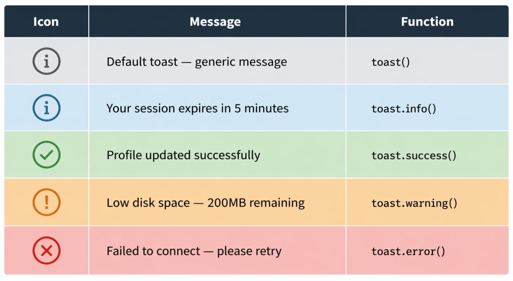
// Default
toast('File saved.');

// Info
toast.info('Your session expires in 5 minutes.');

// Success
toast.success('Profile updated successfully.');

// Warning
toast.warning('Low disk space — 200MB remaining.');

// Error
toast.error('Failed to connect. Please retry.');
The type controls the icon and progress bar color. Content, duration, position – all of that can be overridden per-toast through an options object as the second argument. We’ll get to that.
Positioning
Six positions. Set a default on <ToastContainer /> and override it per-toast when needed:
top-left top-center top-right
bottom-left bottom-center bottom-right
// Global default — all toasts go bottom-right
<ToastContainer position="bottom-right" />

// Override for a single toast
toast.success('Upload complete', {
  position: 'top-center',
});
Top-right is the default and where most users instinctively look. Bottom-right is better if your app has a sticky header – nothing overlaps. Bottom-center tends to feel more native on mobile. Pick one, set it globally, and only override it if you have a real reason.
Custom Styling with CSS Variables (v11)
Before v11, matching your brand meant hunting down deeply nested class selectors and stacking overrides until the specificity gods were satisfied. Now you just set variables in :root:
/* In your global CSS */
:root {
  --toastify-toast-background: #1e1e2e;
  --toastify-toast-bd-radius: 10px;
  --toastify-color-success: #a6e3a1;
  --toastify-color-error: #f38ba8;
  --toastify-color-warning: #f9e2af;
  --toastify-color-info: #89b4fa;
  --toastify-toast-shadow: 0 4px 20px rgba(0, 0, 0, 0.3);
  --toastify-font-family: 'Inter', sans-serif;
}
Need to style just one specific toast? Pass a class name directly:
toast.success('Done!', {
  className: 'my-toast',
  progressClassName: 'my-progress-bar',
});
v11 DOM change
The Toastify__toast-body wrapper is gone in v11. If you’re upgrading from v10 and have CSS targeting that class, those rules will silently stop working. Check your custom styles during migration.
The full list of variables is in the official docs. The naming pattern is predictable: --toastify-color-{type} for semantic colors, --toastify-toast-{property} for layout stuff. Once you’ve set up your :root overrides once, you rarely need to touch toast styling again.
- List key CSS variables:
--toastify-toast-background, --toastify-toast-bd-radius, --toastify-color-success, --toastify-toast-shadow, etc. - Override in
:rootfor global theming - Passing classes via
className, toastClassName, progressClassName - Mention: v11 removed
Toastify__toast-bodywrapper — simpler DOM to style - [IMAGE: Before/after of a default toast vs. brand-themed custom toast]
Transitions & Animations
Four built-in transitions: Bounce (default), Slide, Zoom, and Flip. Bounce works fine for most apps. Slide feels cleaner in dashboards. Zoom is a bit much, but some people love it.
import { ToastContainer, Slide, Zoom, Flip } from 'react-toastify';

// Global — all toasts use Slide
<ToastContainer transition={Slide} />

// Per-toast override
toast.info('Zoom in!', { transition: Zoom });
If none of those work for you, cssTransition() lets you define your own using standard @keyframes:
import { cssTransition } from 'react-toastify';

/* In your CSS */
@keyframes fadeSlideIn {
  from { opacity: 0; transform: translateY(-12px); }
  to   { opacity: 1; transform: translateY(0); }
}
@keyframes fadeSlideOut {
  from { opacity: 1; transform: translateY(0); }
  to   { opacity: 0; transform: translateY(-12px); }
}

// In your component
const FadeSlide = cssTransition({
  enter: 'fadeSlideIn',
  exit: 'fadeSlideOut',
  duration: 250,
});
Promise-Based Toasts
Pass it a promise, give it three strings, and it handles all three states automatically – spinner while pending, success when it resolves, error if it rejects. Zero state management on your end:
const saveUser = () =>
  fetch('/api/users', { method: 'POST', body: JSON.stringify(formData) })
    .then((res) => res.json());

toast.promise(saveUser(), {
  pending: 'Saving user...',
  success: 'User created successfully!',
  error: 'Failed to save. Please try again.',
});
If you need to use the resolved data in your success message, swap the string for a render function:
toast.promise(fetchUser(id), {
  pending: 'Loading profile...',
  success: {
    render({ data }) {
      return `Welcome back, ${data.name}!`;
    },
  },
  error: 'Could not load profile.',
});
Use this anywhere you’re making an async call – form submissions, login requests, data fetching, file uploads. It covers the three states users actually care about, and you write maybe four lines of code to get there.
Controlled Progress Bar
The auto-dismiss countdown bar is fine for most toasts. But for actual file uploads – where you have real progress data coming from Axios – you want the bar to reflect the actual bytes transferred, not a timer.
The pattern is: create the toast on the first upload event, stash its ID in a ref, call toast.update() on every progress tick, then toast.done() when the upload finishes:
import { useRef } from 'react';
import axios from 'axios';
import { toast } from 'react-toastify';

function FileUpload() {
  const toastId = useRef(null);

  const uploadFile = async (file) => {
    const formData = new FormData();
    formData.append('file', file);

    toastId.current = toast(`Uploading ${file.name}...`, {
      progress: 0,
      autoClose: false,
    });

    await axios.post('/api/upload', formData, {
      onUploadProgress: ({ loaded, total }) => {
        const progress = loaded / total;
        toast.update(toastId.current, { progress });
      },
    });

    toast.done(toastId.current);
    toast.success('Upload complete!');
  };

  return <input type="file" onChange={(e) => uploadFile(e.target.files[0])} />;
}
toast.done() snaps the bar to 100% and kicks off normal dismiss behavior. Worth noting: you can chain a toast.update() right after to swap in a success message with a different icon, so the user sees “Upload complete!” instead of the bar just quietly disappearing.
Auto-Close, Delay & Limits
Toasts auto-close after 5 seconds by default. You can change that globally or per-toast – and for errors that actually need the user to do something, turn it off entirely:
// Global — 8 seconds for all toasts
<ToastContainer autoClose={8000} />

// Disable auto-dismiss for this toast
toast.error('Critical error — requires action', { autoClose: false });

// Delay before appearing (useful for staggered notifications)
toast.info('Step 2 complete', { delay: 500 });
We’d recommend setting the limit prop from day one. Without it, if three async operations complete at the same time, you get a stack of three toasts slamming in at once. With a limit of 3, extras queue and wait their turn:
<ToastContainer limit={3} />

// Flush the queue without waiting
toast.clearWaitingQueue();
If you want to nuke the queue rather than let it drain – say, when the user navigates away – toast.clearWaitingQueue() flushes everything pending.
Updating Toasts on Events
toast.update() lets you change a toast’s type, content, and transition while it’s already on screen. The most common pattern is a loading toast that flips to success or error once your async operation settles:
const id = toast.loading('Processing payment...');

// After payment resolves:
toast.update(id, {
  render: 'Payment successful!',
  type: 'success',
  isLoading: false,
  autoClose: 4000,
  transition: Zoom,
});
Small v11 addition worth knowing: the onClose callback now gets a reason argument. It’s true when the user manually closed the toast, undefined when it timed out on its own. Handy if you’re tracking whether users actually read your notifications, or need to trigger something only on explicit dismissal.
Custom Close Button & Drag-to-Dismiss
The default × works fine. But if your design system has specific button styles, or you want to add a label next to it, you can swap it out with any React component:
const CloseButton = ({ closeToast }) => (
  <button onClick={closeToast} style={{ background: 'none', border: 'none', cursor: 'pointer' }}>
    Dismiss
  </button>
);

// Apply globally
<ToastContainer closeButton={CloseButton} />

// Remove the button entirely for a specific toast
toast.success('Auto-dismissing...', { closeButton: false });
Drag-to-dismiss is on by default. draggablePercent controls how far the user has to drag before it snaps away – 80% is the default, which feels about right. Drop it lower if you want it to feel snappier:
// Require an 80% swipe to dismiss (default is 80)
<ToastContainer draggablePercent={80} />

// Disable dragging entirely
toast.info('No dragging this one', { draggable: false });
Accessibility (v11)
This was missing from earlier versions. V11 adds ariaLabel on both the container and individual toasts, plus keyboard navigation:
// Set accessible labels on the container and per-toast
<ToastContainer ariaLabel="Notifications" />

toast.success('File saved', {
  ariaLabel: 'Success: file saved to your account',
});
Keyboard navigation
Pressing Alt+T (default) moves focus to the first visible toast. Users can then tab through any interactive elements inside the toast. The shortcut is customizable via the hotKeys prop on <ToastContainer />.
A side benefit of ariaLabel: your tests get easier. Cypress and Playwright can query toasts by accessible name, rather than brittle class selectors that break whenever the library updates its DOM structure.
For screen readers specifically, the container already renders as a live region internally. User-triggered toasts should use role="status" so the reader announces them politely without interrupting. Critical errors that genuinely need immediate attention can use role="alert", which is assertive and jumps the queue. Don’t use alert for everything, or it becomes noise.
Wrapping Up
React Toastify v11 offers all five toast types, six positions, CSS variable theming, promise states, real upload progress, transition control, drag-to-dismiss, and solid accessibility. So, the vast majority of real-world use cases are covered, and you don’t have to write anything from scratch.
Pro tip: start with the basic install and toast.promise() on your API calls – that alone replaces a surprising amount of manual loading/error UI. Add CSS variable overrides once your design is settled. Everything else in this guide you can reach for when you actually need it, rather than setting it all up on day one.

Share with your community


More Articles

Development
Oct 5, 2026
Cross-Platform App Development Frameworks in 2026: 10 Options Compared, Real Trade-offs, and Chat + AI SDK Fit
In 2026, evaluating cross-platform frameworks is a complex matter. There are many practical questions: Which ones have solid chat and AI SDK support today? Which ones won’t force a painful migration when the next major OS version drops? And what are the real engineering trade-offs once you move past the marketing claims? We’ll look at […]


Healthcare
Oct 1, 2026
HIPAA-Compliant Video API in 2026: What Actually Makes One, Vendor Comparison, and Twilio Video Migration
Consultations, psychiatry meetings, medication management, triage, and other medical encounters often do not require physical presence. Adding video to your healthcare app or platform can be a great idea, as it allows you to hold sessions online without losing the human touch. Using a messaging API to incorporate video into your application makes the whole […]

Try Out Ethora in Action
Experience Ethora's messaging with a dedicated demo from our CEO or start building your App right now!