Glossary
Theming
Defining an app’s colours, fonts, spacing and light or dark mode as named design tokens that every component reads, so one set of brand values changes the whole interface without touching component code.
General definition
Theming separates what a component does from how it looks. Instead of hard-coding a hex value in each button, the button reads color.primary and a theme supplies the value. Swap the theme and every component follows. The named values are called design tokens: the smallest decisions of a design system (a colour, a font size, a spacing step, a corner radius, a shadow) stored as data. The W3C Design Tokens Community Group maintains a JSON format for tokens so design tools and code can share one source.
How theming is implemented per platform:
- Web: CSS custom properties on
:rootor a wrapper, switched by a class or theprefers-color-schememedia query for dark mode; component libraries add a theme provider in React. - React Native: a theme object passed through context, since there is no CSS cascade; libraries expose theme hooks for styles.
- Android: Material theme attributes and Jetpack Compose
MaterialTheme; iOS: asset catalogues with light and dark variants and SwiftUI environment values. - Across all of them: a build step that generates platform files from one token source (Style Dictionary is the common tool).
Well-structured themes use two layers: global tokens (the palette, the type scale) and semantic tokens that map them to roles (background.surface, text.muted, bubble.outgoing). Dark mode is then a second set of semantic mappings rather than a second design. For a messaging UI the roles that matter are incoming and outgoing bubbles, unread accents, presence dots, link colour on both bubble backgrounds and contrast that meets WCAG AA in both modes. Theming is also the mechanism behind white-labelling: one codebase, many brands, each a config file rather than a fork.
In the Ethora ecosystem
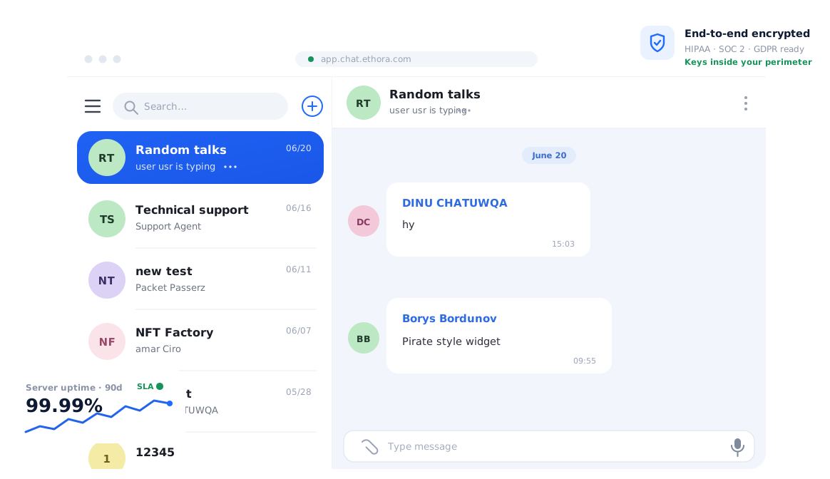
Ethora treats theming as configuration. Since release 26.07, colours, fonts and related visual settings are defined once in the app config and applied by the web chat component, the React Native SDK and the Android SDK, so a brand is set in data rather than in per-platform stylesheets. The same config drives the UI kit elements users actually see: message bubbles, room list, composer, profile and settings screens.
This is what makes a white-labelled app on Ethora a config exercise: an agency or platform running several branded chat apps keeps one codebase and one backend, and each App (Ethora’s isolated per-customer container) carries its own theme alongside its own users, rooms and data. Where a customer needs more than tokens allow, the components are open source, so individual pieces can be restyled or replaced while the rest of the theme still applies. See the white-label chat page for the commercial side.