Glossary
UI Kit
A set of prebuilt, reusable interface components that share one design and can be dropped into an app. For chat, that means the message list, composer, room list, threads and everything else a messaging screen needs.
General definition
UI Kit is the term for a packaged set of interface components, delivered on the web as React or web components and on mobile as React Native, SwiftUI or Jetpack Compose views, that a team installs rather than builds. General-purpose kits (Material UI, shadcn/ui, Chakra, Ant Design) cover buttons, inputs, dialogs and tables. Domain kits go further and ship the screens of one product area, and a chat UI kit is one of the most common because messaging interfaces are large, fiddly and largely the same across products.
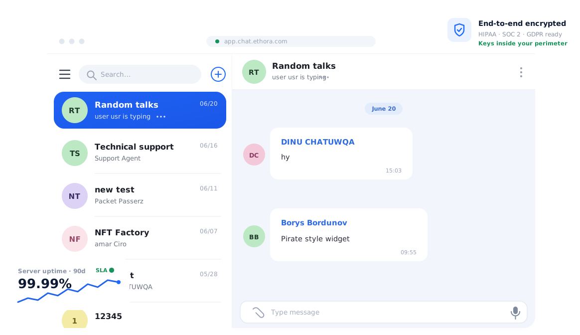
A complete chat UI kit typically includes:
- A room or conversation list with avatars, last message, unread badges and search.
- A message list with virtualised scrolling, date separators, grouping by sender, read receipts, reactions, replies and threads.
- A composer with attachments, mentions, emoji, voice notes and typing indicators.
- Media viewers, file previews, link cards and system messages.
- Profile, member and settings panels, plus call buttons where voice and video are supported.
The two things that separate a usable kit from a demo are theming and escape hatches. A kit should take colours, fonts, spacing and dark mode from one theme so it looks like your product, not the vendor’s, and it should let you replace individual pieces (a custom message bubble, your own header) without forking the whole component. It also matters whether the kit is bound to the vendor’s backend. Most chat UI kits are, which is fine when the backend is open and self-hostable and a problem when it is not. Accessibility, right-to-left layout and localisation support are the usual gaps to check before adopting one.
In the Ethora ecosystem
Ethora ships its chat UI as kits on top of its open-source backend. On the web, the React chat UI kit (@ethora/chat-component on npm, React 19 ready) gives you the room list, message list, composer, threads, reactions, read receipts, typing indicators, presence and file attachments as one themeable component that you configure rather than assemble. The React Native SDK (@ethora/chat-component-rn) was redesigned in 2026 with new chat and profile screens, a media picker and bottom-sheet menus, and native iOS and Android SDKs sit alongside it.
Every kit reads the same deep theming configuration, so a brand’s colours and fonts apply across web, React Native and Android from config rather than per-platform stylesheets, which is what makes a white-label chat practical. Because the components are open source and the backend can run as managed cloud, a dedicated server or self-hosted, the usual UI-kit trade-off of being tied to a closed service does not apply: you can restyle, extend or replace pieces of the UI and still own the data behind it.