Glossary
Chat Bubble
Two things share the name: the rounded box around each message in a conversation, and the round launcher button that opens a website chat widget. Both carry a lot of the design of a chat product.
General definition
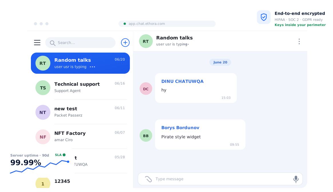
The Chat Bubble as a message container is the visual grammar of modern messaging. Outgoing messages sit on one side in the brand colour, incoming on the other in a neutral tone, consecutive messages from one sender group together, and the bubble carries timestamps, delivery and read marks, reactions and a reply-to preview. The shape signals conversation; the alignment signals who said it. It descends from comic-strip speech balloons and was popularised by smartphone messaging apps.
- Grouping: bubbles from the same sender within a short window share one avatar and one timestamp to reduce noise
- Content types: text, images, files, voice notes, link previews, quoted replies and system messages each have bubble variants
- States: sending, sent, delivered, read, failed, edited and deleted are shown on or beside the bubble
- Accessibility: sufficient contrast in both colours, readable at large font sizes, and a sensible reading order for screen readers
The second meaning is the launcher of a chat widget: the circular button, usually bottom-right, that shows an icon or avatar, sometimes an unread badge or a short greeting, and opens the conversation panel when clicked. Its job is to be noticed without being annoying: sized for touch, offset from the page’s own controls, hidden or minimised where it would block content, and consistent with the site’s brand.
Both bubbles are the first thing a design team asks to change, which is why chat products expose them through theming: colours, radius, font, avatar shape and launcher icon come from design tokens rather than from code changes, and a UI kit supplies the bubble components ready to restyle.
In the Ethora ecosystem
Ethora’s chat components draw the message bubbles for you and let you restyle them from configuration. Deep theming from config applies across the web component, the React Native SDK and the Android SDK, so brand colours, fonts and shapes are set once and the bubbles, reactions, read receipts, threads and reply previews follow. The React chat UI kit includes the message list and composer, and the React Native SDK’s redesigned chat screens use the same bubble conventions on mobile.
For the launcher meaning, the embeddable AI assistant widget provides a floating bubble that opens an iframe-based assistant on any site with a single script tag, and the white-label chat option lets a reseller ship the whole experience under its own brand.