React Native
Chatbot UI Examples: 15+ Designs & Best Practices That Actually Convert

Сhatbots help businesses provide 24/7 support for their users and avoid losing potential customers. 80% of consumers have interacted with a chatbot, yet 60% of them would rather wait in a queue for a human agent. The gap isn’t usually the AI. It’s the interface. Confusing button labels, no fallback to a human agent, a color scheme that looks nothing like the rest of the product – users bounce before the model ever gets a chance to help them. As a result, you get low engagement and high abandonment.
Most teams spend months on chatbot logic and an afternoon on the UI. It tends to show. This guide looks at 15+ real chatbot interfaces – what they do well, what’s worth copying, and where the design decisions get interesting – plus seven practical principles and a clear-eyed look at when widget builders stop being enough.
What Is Chatbot UI & Why It Matters
Chatbot UI is all the visual and interactive elements of the chat. Core elements are:
- Avatar + bot name
- Online status indicator
- User message bubbles
- Bot message bubbles
- Quick-reply buttons
- Input field + send button
UX (user experience) is how easy it is for a user to get what they need, and how understandable the flow is. If they would like to use your bot again, this means the UX is good.
User interface impacts the following metrics:
- Engagement (user starts a conversation)
- Task completion rate (user gets what they came for)
- Handoff rate (how often the bot fails and escalates to a human)
- CSAT (customer satisfaction score) after the interaction.
Confusing UI will score badly on all four, no matter how good the underlying AI model is. Make sure to track these metrics, so you’ll know how well your chatbot performs.
What Makes a Good Chatbot Interface
Here’s a quick checklist of things that separate a good chatbot from one that users would likely abandon in a minute. Use it when building your AI-assistant.
- Self-explanatory from the first message. No user should have to wonder what the bot can do. A short welcome message and 2-3 suggested reply options solve this immediately.
- Visually consistent with your product. A chatbot that looks completely different from your app’s design system signals “third-party widget” and breaks trust.
- Mobile-responsive. The majority of chatbot interactions happen on phones. If your chat UI is designed desktop-first, you’ll see it in your completion rates.
- Accessible (WCAG 2.1 AA at minimum). Sufficient color contrast, keyboard navigability, and screen reader compatibility. Often the last thing on the checklist and the first thing that fails an accessibility audit.
- Multimedia support. Images, files, and voice input where it’s relevant. Text-only bots work; multimedia bots handle more use cases.
- A clear path to a human. Users who can’t see an escalation option don’t ask for one – they leave. “Talk to a person” should always be visible.
- Customizable to your brand. Color scheme, widget icon, display name, tone, light/dark mode. If your builder doesn’t expose all of these, you’ll hit a wall before you’ve got the UI where it needs to be.
15+ Chatbot UI Examples
Now let’s look at the examples. We’ll start from the simplest option – no-code builders.
Group A – No-Code Chatbot Builders
1. Sendbird
AI agent platform with a clean, white-space-forward layout — minimal chrome, rounded bubbles, quick-reply buttons that don’t crowd the conversation.
- Generous padding around messages keeps it readable at any conversation length
- Customizable quick-reply button labels and colors
- Avatar supports a custom brand image or initials fallback
- Widget expands to full-screen on mobile without layout breakage
Takeaway: A clutter-free baseline is the right foundation – it’s easier to add visual elements to a clean canvas than to strip them from a noisy one.
2. HubSpot (HubBot)
Minimalist two-tone design – one background color per speaker, optimized around meeting booking and lead qualification flows.
- One accent color for bot messages, neutral white for user – visually maps the conversation without explicit labels
- Inline calendar picker embedded directly in the chat flow
- No unnecessary UI chrome – every element earns its space
Takeaway: Reducing visual decisions reduces cognitive load. If your bot does one job (book meetings), design it to do that one job and get out of the way.
3. Tidio
Facebook Messenger-influenced layout with a color gradient header, live status indicator (“We’re online”), emoji, and attachment support baked in.
- Familiar layout pattern lowers the learning curve – users already know this interaction model
- Status indicator (“We’re online / typically replies in 3 minutes”) sets expectations immediately
- Emoji reactions on messages signal approachability
Takeaway: Borrowing familiar UI patterns reduces onboarding friction. Users who recognize the interface don’t have to learn it.
4. Drift
Quick-reply-first design built around lead generation – guided button options at the top of each message, free-text input as secondary.
- Buttons always appear before the input field – the path of least resistance is the intended one
- Rich media cards (video, product images) are available as a fallback when text isn’t enough
- Conversation routing visible in UI – users know when they’re talking to a bot vs. a human
Takeaway: For conversion-focused flows, guided buttons outperform open text. But keeping free text available handles users who don’t fit the options.
5. Chatbot.com
Color-segmented message bubbles with varied widths based on message length – button outlines instead of filled buttons, reducing visual weight in dense conversations.
- Variable bubble width mirrors natural conversation rhythm
- Outline-style CTA buttons reduce visual noise vs. filled buttons in a long exchange
- Drag-and-drop visual builder previews UI in real time
Takeaway: Visual hierarchy matters more as conversations get longer. When every bubble is the same size, the eye has nowhere to go.
6. HelpCrunch
Multichannel platform (web chat, email, knowledge base in one widget) with background/wallpaper customization and pre-written message templates for agents.
- Widget background customization extends brand presence into the chat canvas itself
- Seamless switch between chat, email, and knowledge base without widget reload
- Canned response templates are visible to agents in the same interface that users see
Takeaway: If your support spans multiple channels, a unified widget that doesn’t break the visual context beats five separate tools, and users can see the seams between.
7. Landbot
Block-based no-code builder with WhatsApp deployment option and rich media. For clarity, Landbot is rule-based, not AI-powered. Flows are predetermined. If the user says something outside the script, the bot doesn’t adapt.
- Full-screen conversational form layout – less widget-like, more like a guided experience
- WhatsApp deployment means users interact in an app they already open daily
- GIFs and video embeddable within flows
Takeaway: No-code doesn’t automatically mean AI. Rule-based bots have their place – they’re more predictable in regulated industries – but they have a hard ceiling on anything the flow didn’t anticipate.
Group B – Real-World Business Chatbots
These chatbots will fit industries like e-commerce, healthcare, real estate, and fintech.
- Domino’s (e-commerce)
Multi-platform ordering bot (web, app, Messenger) with carousel product menus and quick-reply size and topping selection.
- Horizontal carousel for pizza options keeps the conversation flowing without external navigation
- Quick-reply buttons for size, crust, and toppings eliminate typing entirely for most of the order
- Order confirmation embedded in the chat thread – no redirect to a separate page
Takeaway: When the primary job is a transaction, carousels and quick replies beat open-ended conversation. Every typing step you remove is a drop-off point you eliminate.
- Home Depot (Retail)
Minimalist menu-based bot where the most common query (“Help with existing order”) appears visually distinct at the top in a different color from the other options.
- Primary intent highlighted visually – users with the most common problem see their answer before they read anything
- Menu options ordered by frequency, not alphabetically
- Department routing (Appliances, Tools, Services) reduces misdirected queries
Takeaway: Surface your top use case visually. If 40% of users are coming to track an order, that should be the most prominent thing in the interface.
- Redfin (Real Estate)
Information-dense property listings embedded directly inside the chat – images, price, square footage, address – alongside a subtle color scheme and CTA buttons (“Talk to a person,” “Schedule a tour”).
- Rich data cards inside the chat thread eliminate the need to open a new tab mid-conversation
- Two CTAs per listing – one for more information, one for immediate action
- Muted color palette prevents the information density from feeling overwhelming
Takeaway: Dense doesn’t mean cluttered when layout and color are controlled. The constraint is visual hierarchy, not information volume.
- Bank of America/Erica (Fintech)
Voice and text input, over 2,200 intent variations recognized for common queries, spending habit visualizations rendered as charts inside chat, dark blue theme throughout.
- Dark navy blue color palette – trust signaling that’s common across regulated industries (fintech, healthcare, legal)
- Spending visualizations embedded in chat thread – data that would normally require navigating to a separate report section
- Voice and text parity – users switch modes mid-conversation without losing context
Takeaway: Dark themes signal seriousness and trust in regulated contexts. If your chatbot handles financial or medical data, color psychology matters more than it does in e-commerce.
- Youper (Healthcare)
Mental health support chatbot with mood-colored quick-reply buttons and a conversation flow designed to feel empathetic rather than transactional.
- Quick-reply buttons use warm color gradients that correspond to emotional states – not arbitrary brand colors
- Short messages with deliberate pacing – no walls of text, no rushed data collection
- Clear escalation to human therapists when the AI reaches its appropriate limit
Takeaway: Healthcare chatbots need to feel different from retail ones. The pacing, the color choices, the message length — all of it signals whether the product takes the user’s emotional state seriously.
Group C – Experimental / Concept Designs
- Replika (Experimental)
AI companion with optional AR 3D avatar mode, voice and text, conversation history that persists and influences future interactions.
- 3D avatar in AR – face tracking, ambient animations, visible emotional states
- Personality evolves based on conversation history, not just the current session
- Voice mode with natural response timing (deliberate pauses, not instant replies)
Takeaway: Avatar and AR features are genuinely engaging but add significant UI complexity that most business chatbots don’t need. Know your use case before borrowing from consumer AI companion design.
- Animated bubble UI (Concept)
Typed messages detach and float as animated bubbles into the conversation thread, with physics-based movement and color transitions on delivery.
- Micro-animation on message send provides clear feedback without a status indicator
- Physics-based movement makes the interaction feel tangible rather than digital
- Color transition on message delivery communicates state (sending – delivered) implicitly
Takeaway: Micro-animations that communicate state (sending, delivered, read) are functional, not decorative. The best ones make the status obvious without requiring the user to read a status label.
- Single-function appointment scheduler (Concept)
One-job chatbot UI – booking appointments – with rotating visual menu icons, calendar integration embedded inline, and confirmation sent in-thread.
- Visual rotating menu shows available time slots without a modal calendar overlay
- Colorful time-of-day indicators (morning/afternoon/evening) reduce cognitive effort in choosing a slot
- Booking confirmation, reminders, and rescheduling are all handled inside the same thread
Takeaway: Single-purpose chatbots often outperform multi-purpose ones because design decisions are optimized for one specific outcome. If the user’s goal is to book an appointment, they don’t need other options to click.
Where Widget-Based Chatbot UIs Break
Widget builders get you to v1 fast. For a marketing site, FAQ bot, or a basic support widget, that’s genuinely the right call – setup in an afternoon, iterate quickly, see what your users actually want.
The ceiling shows up when requirements get specific:
- Custom UI control Widget builders let you change colors and icons. They don’t let you restructure the layout, build custom interaction patterns (embedded calculators, multi-step forms inside the chat thread, inline product carousels), or integrate messaging into a complex app flow without it looking like a bolt-on.
- BYO LLM Most builders lock you to their AI provider or to ChatGPT specifically. Switching from GPT-4 to Claude to an open-source model is not an option – you use their AI stack, or you find a different builder.
- Self-hosting Every major no-code chatbot builder is SaaS-only. For healthcare, fintech, or any regulated industry, that’s often a conversation-ender with the compliance team.
- Compliance HIPAA and SOC 2 require infrastructure control that a hosted widget can’t provide. You need audit trails on infrastructure you can audit, encryption you configured, and a BAA from a vendor who understands what signing one means.
- Vendor exit No code export. If your provider raises prices, gets acquired, or changes terms, you’re rebuilding – not migrating.
- Real-time depth Typing indicators, presence, offline sync, end-to-end encryption – most widget builders have shallow implementations of these, if they have them at all.
Widget builders will work for simple projects such as an MVP, straightforward support flows, or marketing pages. But if a chatbot is a core part of your product, you work in a regulated industry, or the per-seat price will be painful at scale, you’ll need a UI built as code.
7 Best Practices for Chatbot UI Design
Now, let’s consider recognized UI techniques that can help you deliver superior results.
3-color scheme
The 60/30/10 rule ensures the interface is readable, without looking flat. In this scheme, 60% is the dominant background color, 30% secondary color for bot messages, and 10% accent color used for elements like buttons, links, text, etc.
Design for your use case
Generic chatbot templates may be a starting point, but not a destination – figure out your primary user intent and optimize the interface specifically for that.
A customer service needs a “Talk to an agent” button. An e-commerce bot needs carousels and product cards. A lead-gen bot needs form integration and CRM handoff. A mental health chatbot needs a completely different pacing and color language from all of those.
Follow standard layout conventions
Input field at the bottom center. Send button at the bottom right. Emoji and attachment icons at the bottom left. Bot avatar and name at the top left. Menu or minimize at the top right. These aren’t rules someone made up – they’re patterns users have internalized from hundreds of chat interfaces. Deviating without a strong reason adds friction before the conversation even starts.
Define tone and personality
Your brand has a voice. Your AI support agent should have it too. It can be the same as your company’s tone of voice, or it can differ. Whether it’s professional, playful, or friendly, be consistent and apply it not only to the conversation, but to buttons and even error states – the bot that sends warm welcomes but is cold in handling errors creates a trust discontinuity. AI chatbots can adopt any voice convincingly; the work is defining it upfront and auditing the full conversation flow against it.
Use conversational UI elements
Welcome messages, quick-reply buttons, suggested follow-ups – these don’t just reduce typing, they guide users toward outcomes the bot can actually deliver. Bots with guided reply options usually see significantly higher engagement than open-text-only interfaces. The reason for this is obvious: users who don’t know what the bot can do won’t ask the right questions.
A/B test and analyze
Test your welcome message copy. Test button label wording. Test with the escalation path visible vs. buried. The variables that matter most are rarely the ones you’d guess upfront. Track engagement, task completions, hand-off rates, and other metrics that make sense for you. Many chatbot builders offer built-in analytics dashboards – use them to make UI decisions.
Optimize for accessibility and devices
We live in a mobile-first world, which means a lot of interactions with chatbots happen on smartphones. Make sure your UI is responsive and won’t break once people switch from a laptop to a tablet or phone.Also, add multimedia in case your user may need to share a photo or a receipt. Voice input is an option, not a novelty. Additionally, if there’s a chance for international users, ensure they can receive an answer in their language – it shouldn’t be a problem with modern LLMs.
How to Create a Chatbot UI
We outlined the three main paths that you can use, depending on how much control you need and your team capacity.
| Full custom | No-code builder | SDK with React Components | |
| Required time | Weeks to months | Minutes to hours | Hours to days |
| The process | Figma design → build messaging backend → wire AI engine (OpenAI, Anthropic). | Drag-and-drop with AI integrations. Zapier, Shopify, and WordPress connectors built in. | Pre-built chat UI components → plug in your LLM → deploy on your infrastructure. |
| Comments | Maximum control, maximum time. Right when you have genuinely unique requirements that no platform covers. | Right for MVPs, marketing sites, and simple support flows. Hits a wall at compliance, custom layout, or BYO LLM requirements. |
Full code ownership. Faster than custom, more control than no-code. Right when the chatbot is core to your product. |
Build Your Own: Scaling Chat UI with Ethora
When the no-code ceiling shows up – compliance requirements, custom layout, BYO LLM, self-hosting – Ethora is the SDK-based alternative. You get pre-built components that work, full code ownership, and the ability to deploy anywhere. Here’s what it offers:
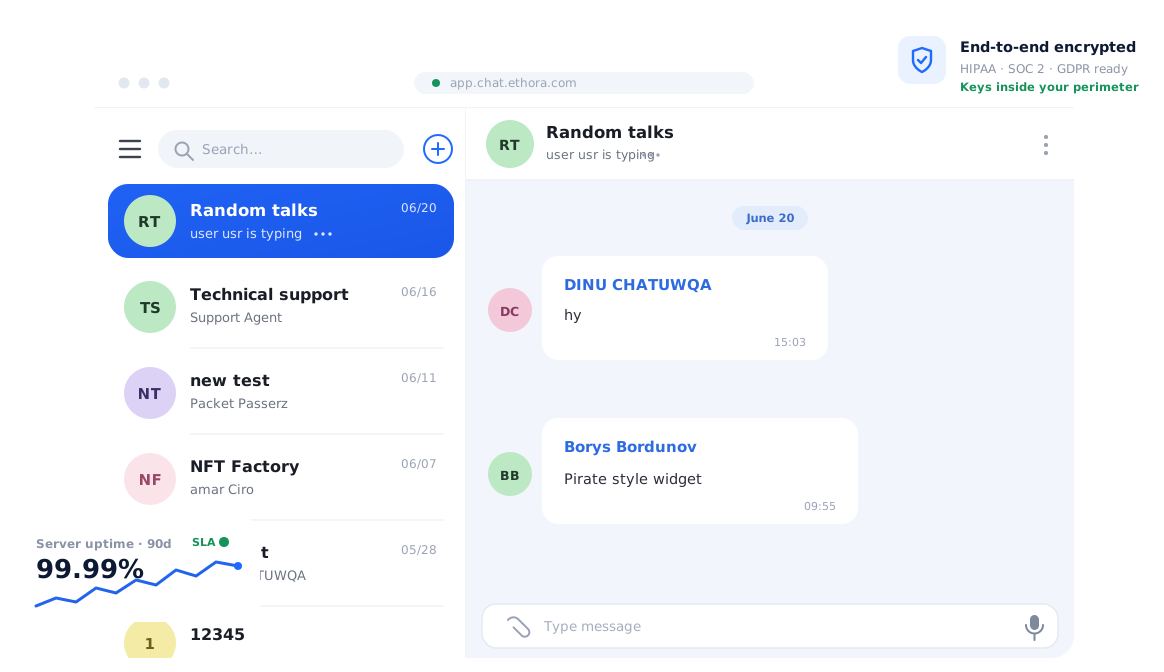
React UI Kits. Pre-built chat UI components for React and React Native. Not a widget you embed; actual component code you own, customize, and extend. chat UI kit, React chat component, React Native chat library – it’s all modifiable source.
Chat Widget. 5-minute embed for quick deploys on any website. The shortcut when you need a chatbot live today and want to validate before building a custom UI.
AI Bots SDK. Plug in OpenAI, Anthropic, or any custom LLM. Multi-turn conversations, function calling, webhooks. Switch models by changing one config value — no re-integration.
RAG Crawler. Point it at a URL, and it builds a knowledge base automatically. No manual document preparation or training pipeline.
Chat & Docs Engine. End-to-end encryption, offline sync, full audit trails. The production-grade infrastructure layer behind the UI.
Marketplace Chat SDK. Shopify, WooCommerce, and Magento integrations built in. Seller-buyer messaging without building the integration from scratch.
Deployment options. Cloud, on-premises, AWS Marketplace, private cloud.
Compliance. Built-in compliance with regulations like GDPR, CCPA, HIPAA, and SOC 2. Real deployments include Dr. Talks (a HIPAA-compliant AI medical assistant with a custom chat UI) and Atom Advantage (workers’ comp nurse-caseworker communication platform).
You can build with Ethora for free. Our free version is enough to build a basic chatbot or an MVP. Free tier includes the full React UI Kit, AI Bots SDK, and self-hosted deployment option. And you don’t need a credit card to start.

Share with your community


More Articles
Development
Oct 5, 2026
Cross-Platform App Development Frameworks in 2026: 10 Options Compared, Real Trade-offs, and Chat + AI SDK Fit
In 2026, evaluating cross-platform frameworks is a complex matter. There are many practical questions: Which ones have solid chat and AI SDK support today? Which ones won’t force a painful migration when the next major OS version drops? And what are the real engineering trade-offs once you move past the marketing claims? We’ll look at […]

Healthcare
Oct 1, 2026
HIPAA-Compliant Video API in 2026: What Actually Makes One, Vendor Comparison, and Twilio Video Migration
Consultations, psychiatry meetings, medication management, triage, and other medical encounters often do not require physical presence. Adding video to your healthcare app or platform can be a great idea, as it allows you to hold sessions online without losing the human touch. Using a messaging API to incorporate video into your application makes the whole […]

Try Out Ethora in Action
Experience Ethora's messaging with a dedicated demo from our CEO or start building your App right now!